|
Colour Theory Colour is logos can be very important as it can dictate how the customer views that channel due to different colours giving off different impressions and feelings. Each brand and logo will try and use colours that reflect the channels feel and content in order to make the viewers feel like they relate to that channel. Designers need to take into consideration that keeping a consistent colour theme that relates to the channel is key in keeping an audience interested and invested in a channel. Colour does more than catch your eye or draw you in it can create meaning through emotions and trigger certain feelings within a person. An example of this would be the colour of Yellow is associated as the colour of sunshine and it’s also associated with happiness, joy, intellect and energy. Whereas the colour of black is associated with power, elegance, formality, death, evil and mystery. A channels logo and colour scheme can represent where that channels stands within society and it can represent the target audience or their lifestyle. Logo 1 – Nickelodeon: The primary colour in this logo is Orange and this colour is said to combine the energy of red and the happiness of yellow. It is associated with joy and sunshine. The colour also represents enthusiasm, fascination, happiness and creativity among others. This colour is perfect for a channel like this for a number of reasons. The emotions and feelings that the colour represents fits the channel as the target audience for this channel is a much younger audience and the main type of shows that are shown on this channel are cartoons therefore the idea of creativity is represented very well. Logo 2 – CBBC: This logo doesn’t have one standout primary colour; this shows its diversity due to the amount of different colours that all represent different emotions and feelings. Each of the colours represents a different feeling and emotion and these combined can create a whole range of things, green for instance is the colour of nature and its symbolizes growth, harmony and freshness. Also green is heavily corresponded with safety, which can reassure the younger audience of this channel. The colour of blue on this logo is associated with depth, stability. It also symbolizes trust, loyalty, wisdom, confidence and intelligence. All of these are important qualities that young people should adapt and try and focus on as much as possible. Logo 3 – BBC Three: The primary colour in this logo is purple and this combines the stability of blue and the energy of red. Purple is also associated with independence, creativity, mystery and magic. This colour fits the channel very well as the sort of shows on this channel are very different and creative and this colour scheme can help to bring out the creative side of people. Also according to recent surveys 75% of pre-adolescent children prefer purple o all other colours therefore using this colour, as the channels primary colour in their logo will attract a wide range of people to this channel. Logo 4 – BBC One: The primary colour in this logo is red and this is the colour of fire and blood, it’s associated with energy, war, danger, strength, power, determination, passion, desire, and love. Almost all of these emotions and feelings are portrayed in one way or another on this channel through its wide range of TV shows that are broadcast to a wide audience. Red also is an accent colour that can stimulate people to make quick decisions therefore when I catches someone’s eye when they are looking at various TV channels they might decide to stay on this channel and watch the content on this channel. 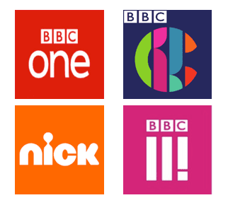
0 Comments
|
- Blog
- About
-
Music Video
-
1
>
- 1.1 The Purposes Of Music Videos
- 1.2 Music Genre Conventions
- 1.3 Music Video Styles
- 1.4 Music Video Recipe
- 1.5 Digital Editing Revolution, History of Editing Timeline
- 1.6 Editing Case Study
- 1.7 Cinematography Rule
- 1.8 Single Camera TV Comparative Table
- 1.9 Single Camera Analysis - OK Go
- 1.10 Meaning Conveyed in Music Videos
- 1.11 Narrative Theory Glossary
- 1.12 NME Videos Analysis
- 1.13 Music Video Directors Research
- 1.14 Record Label Case Study
- 2 >
- 3 >
-
1
>
-
IDENT
- Assignment 1 >
- Assignment 2 >
-
Assignment 3
>
- 3.1 Ideas Mind Map
- 3.2 Idea Development
- 3.3 Storyboards
- 3.4 Justification of Final Idea
- 3.5 Proposal
- 3.6 Final Storyboard
- 3.7/8 Production Schedule
- 3.9 Location Recce
- 3.10 Risk Assessment
- 3.11 Budget
- 3.12 Crew Roles
- 3.13 Expansion Into Suit of Ideas
- 3.14 Client Notes
- 3.15 Revised Proposal & Planning
- Assignment 4 >